Video
What's New in Android Developer Tools
Android Studio offers an advanced layout editor that allows you to drag-and-drop widgets into your layout and preview your layout while editing the XML.
Within the layout editor, you can switch between the Text view, where you edit the XML file as text, and the Design view. Just click the appropriate tab at the bottom of the window to display the desired editor.
Editing in the Text View
You can use the Text view to edit your layout file. This section describes some of the features that are available in the Text view.
Preview
While editing in the Text view, you can preview the layout on devices
by opening the Preview pane available on the right side of the window.
Within the Preview pane, you can modify the preview by changing various
options at the top of the pane, including the preview device, layout theme, platform
version and more. To see a preview of how your app would look with a particular device
skin, click the preview icon
 and choose the desired device, such as Nexus 4:
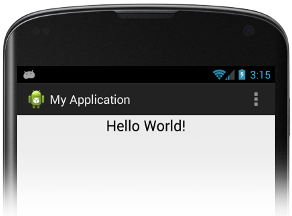
Figure 1. Previewing your app.
To preview the layout on multiple devices simultaneously, select Preview All Screen Sizes from the device drop-down.
When you click in the preview image, the layout editor highlights the corresponding section in the XML, and vice-versa.
Interactive error detection and recovery
As you edit the Text view of your layout XML file, Android Studio flags typos and offers assistance.
For example, suppose you are adding a button, and you misspell it as "Buttonn". Android Studio helps you to correct it by displaying an error such as the following, where you can click on "Change to Button" to fix the error in the XML file:
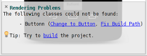
Figure 2. Flagging errors.
Android Studio also prompts you to supply missing information. For example, suppose you start adding a fragment to your layout XML file. First of all, Android Studio displays auto-complete suggestions as you type. Once it becomes clear that you are adding a fragment, Android Studio displays an error panel with links that you can click to supply the missing attributes. Clicking "Automatically add all missing attributes" in this case does just that—it completes the fragment definition in your layout XML file:
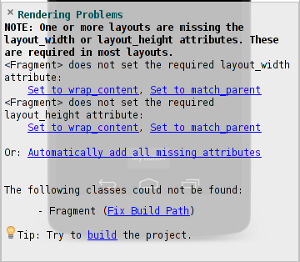
Figure 3. Supplying missing information
Picking a theme
To pick a theme for your app, click the Theme icon
 .
.
This displays the Select Theme dialog, where you can search for a particular theme and/or select one from the list on the right hand side. The theme you choose will be reflected in the previewed image.
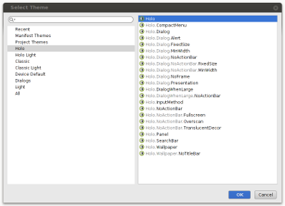
Figure 4. Specifying a theme.
Localization
Android Studio provides built-in localization support. When you click the
localization icon
 ,
you can select a particular locale, add and edit translations, preview the locales your
app supports (all locales or just a single locale), and preview right-to-left layout for
languages that are RTL.
,
you can select a particular locale, add and edit translations, preview the locales your
app supports (all locales or just a single locale), and preview right-to-left layout for
languages that are RTL.
See Supporting Different Languages for a description of how to support different locales in your app.
For example, here is a preview of a "Hello World" app for the
 locale:
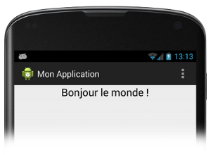
Figure 5. Previewing locales.
Editing in the Design View
You can switch to the graphical editor by clicking Design at the bottom of the window. While editing in the Design view, you can show and hide the widgets available to drag-and-drop by clicking Palette on the left side of the window. Clicking Designer on the right side of the window reveals a panel with a layout hierarchy and a list of properties for each view in the layout.
When you drag a widget into the graphical layout for your app, the display changes to
help you place the widget. What you see depends on the type of layout. For example, if
you're dragging a widget into a FrameLayout, it displays a grid to
help you place the widget, as shown in figure 6:
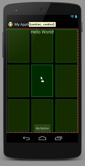
Figure 6. Using the grid layout to place a widget.
Within the graphical editor, you can rearrange your app's UI by dragging widgets to the desired location.
Taking a snapshot
When you run your app on a connected device, you can take a snapshot of it by clicking
the camera icon
 to the left of the logging
panel (at the bottom of the window by default). This takes a snapshot of your running app
(or whatever is currently displayed on your device) and displays it in a window. Check
Frame Screenshot to show your screenshot within the device skin of your
choice. You can also specify whether you want the image to have screen glare and/or a drop
shadow. Once you have the desired effect, you can save the image.
to the left of the logging
panel (at the bottom of the window by default). This takes a snapshot of your running app
(or whatever is currently displayed on your device) and displays it in a window. Check
Frame Screenshot to show your screenshot within the device skin of your
choice. You can also specify whether you want the image to have screen glare and/or a drop
shadow. Once you have the desired effect, you can save the image.
You can use the same process to create a snapshot of your app's preview. Just click the camera icon in the preview area and follow the steps for adding a device skin.