We wish we could guarantee that if you follow every piece of advice on this website, everyone will be able to learn and use your app without a hitch. Sadly, that's not the case.
Some of your users will run into questions or problems along the way. They'll be looking for answers within your app, and if they don't find them quickly, they may leave and never come back.
This page covers design patterns for making help accessible in your app and tips for creating help content for users who are eager for assistance.
Designing Help into Your App
Don't show unsolicited help, except in very limited cases
Naturally, you want everyone to quickly learn the ropes, discover the cool features, and get the most out of your app. So you might be tempted to present a one-time introductory slideshow, video, or splash screen to all new users when they first open the app. Or you might be drawn to the idea of displaying helpful text bubbles or dialogs when users interact with certain features for the first time.
In almost all cases, we advise against approaches like these because:
- They're interruptions. People will be eager to start using your app, and anything you put in front of them will feel like an obstacle or possibly an annoyance, despite your good intentions. And because they didn't ask for it, they probably won't pay close attention to it.
- They're usually not necessary. If you have usability concerns about an aspect of your app, don't just throw help at the problem. Try to solve it in the UI. Apply Android design patterns, styles, and building blocks, and you'll go a long way in reducing the need to educate your users.
The only reason for showing pure help content to new users unsolicited is:
To teach high value functionality that's only available through a gesture.
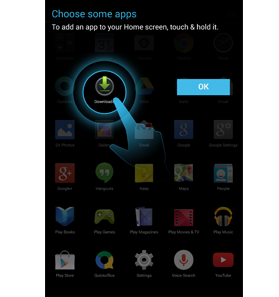
For example, we use help content to teach users how to place apps on their Home screen. This functionality is:
- High value
Without it, users wouldn't be able to customize the most frequently visited Android screen to meet their needs.
- Available only through a gesture
Because there's no button or menu for it, users might not ever discover it on their own.
However, not all high value gesture-only functionality needs a tutorial. For example, don't teach users how to scroll content. They already know how because it's a fundamental, system-wide interaction.
Bottom line: when it comes to offering help in your app, it's much better to let users come to you when they need it.
Follow the standard design for navigating to help
On every screen in your app, offer help in the action overflow. Always make it the very last item in the menu and label it "Help".
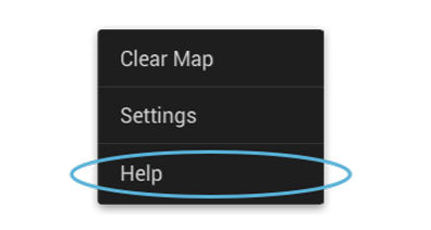
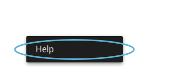
We've established this standard design so that when users are desperate for help, they won't have to hunt to find it (see design principle: Give me tricks that work everywhere).
Assume that every call for help is urgent
In addition to help, you might want to expose other information, such as copyright info, credits, terms of service, and privacy policy.
Let users access this information through the Help menu item, but optimize the flow for people with urgent questions about how to do something or why something is happening in your app. The smaller subset of users who are looking for legal fine print or the names of the people who created the app won't be as burdened by taking a few extra steps.
The same is true for any communication options you might want to provide, such as contacting customer support or submitting feedback. Offer these options in a way that doesn't add an extra step before users see help. When you put the help content forward, you increase the likelihood that users will find the answers on their own, which in turn reduces your support costs.
When someone chooses "Help":
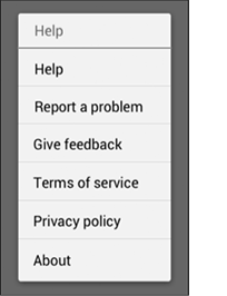
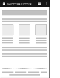
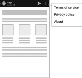
Don't
Present a dialog asking them to choose between help and other options.
Better
Immediately launch a web browser with help content. Place other options in a footer.
Even Better
Build a help screen in your app and offer other options in the action bar. For example, you could let users contact you with questions or feedback through an action button. The action overflow is the ideal place for non-help information that users rarely need.
This requires more development work than launching a web browser, but it's a nicer experience for users because they don't leave your app to get the help they need and doesn't require a network connection.
Principles for Writing On-Screen Help Content
Help is part of the UI
On-screen help is an extension of your app's UI, not a description of it. All words on the screen from the core app to the help should follow our Writing Style principles so that the end-to-end experience feels seamless and cohesive.
Make every pixel count
It's not necessary to document every single detail about your app, especially things that are extremely apparent just by looking at the UI, or behaviors that are standard for the platform. Surface just the key additional information that the on-screen text doesn't have room to describe, in a way that makes it easy to map to the screen.
Pictures are faster than words
In describing key UI elements and providing step-by-step instructions, consider combining text with icons, partial screenshots with callouts, and other imagery. You'll need fewer words to explain things, and users will absorb the information more quickly.
Help me scan, not read
People don't read help from start to finish. They scan around, looking for a piece of information containing the answer they need. Make it less burdensome with friendly formatting and layout choices like bold headings, bulleted and numbered lists, tables, and white space between paragraphs. And if you have a large amount of content, divide it into multiple screens to cut down on scrolling.
Take me straight to the answer
What's better than a screen that's easy to scan? A screen that requires no scanning at all because the answer's right there. Consider having each screen in your app navigate to help that's relevant just to that screen. We call this contextual help, and it's the holy grail of user assistance. If you take this approach, be sure to also provide a way to get to the rest of the help content.