This lesson teaches you to:
You should also read
Now that users can navigate deep into the application's screen hierarchy, we need to provide a method for navigating up the hierarchy, to parent and ancestor screens. Additionally, we should ensure that temporal navigation via the Back button is respected to respect Android conventions.
Back/Up Navigation Design
For design guidelines, read Android Design's Navigation pattern guide.
Support Temporal Navigation: Back
Temporal navigation, or navigation between historical screens, is deeply rooted in the Android system. All Android users expect the Back button to take them to the previous screen, regardless of other state. The set of historical screens is always rooted at the user's Launcher application (the phone's "home" screen). That is, pressing Back enough times should land you back at the Launcher, after which the Back button will do nothing.

Figure 1. The Back button behavior after entering the Email app from the People (or Contacts) app.
Applications generally don't have to worry about managing the Back button themselves; the system handles tasks and the back stack, or the list of previous screens, automatically. The Back button by default simply traverses this list of screens, removing the current screen from the list upon being pressed.
There are, however, cases where you may want to override the behavior for Back. For example, if your screen contains an embedded web browser where users can interact with page elements to navigate between web pages, you may wish to trigger the embedded browser's default back behavior when users press the device's Back button. Upon reaching the beginning of the browser's internal history, you should always defer to the system's default behavior for the Back button.
Provide Ancestral Navigation: Up and Home
Before Android 3.0, the most common form of ancestral navigation was the Home metaphor. This was generally implemented as a Home item accessible via the device's Menu button, or a Home button at the top-left of the screen, usually as a component of the Action Bar (pattern docs at Android Design). Upon selecting Home, the user would be taken to the screen at the top of the screen hierarchy, generally known as the application's home screen.
Providing direct access to the application's home screen can give the user a sense of comfort and security. Regardless of where they are in the application, if they get lost in the app, they can select Home to arrive back at the familiar home screen.
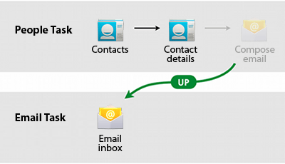
Android 3.0 introduced the Up metaphor, which is presented in the Action Bar as a substitute for the Home button described above. Upon tapping Up, the user should be taken to the parent screen in the hierarchy. This navigation step is usually the previous screen (as described with the Back button discussion above), but this is not universally the case. Thus, developers must ensure that Up for each screen navigates to a single, predetermined parent screen.

Figure 2. Example behavior for up navigation after entering the Email app from the People app.
In some cases, it's appropriate for Up to perform an action rather than navigating to a parent screen. Take for example, the Gmail application for Android 3.0-based tablets. When viewing a mail conversation while holding the device in landscape, the conversation list, as well as the conversation details are presented side-by-side. This is a form of parent-child screen grouping, as discussed in a previous lesson. However, when viewing a mail conversation in the portrait orientation, only the conversation details are shown. The Up button is used to temporarily show the parent pane, which slides in from the left of the screen. Pressing the Up button again while the left pane is visible exits the context of the individual conversation, up to a full-screen list of conversations.
Implementation Note: As a best practice, when implementing either
Home or Up, make sure to clear the back stack of any descendent screens. For
Home, the only remaining screen on the back stack should be the home screen. For
Up navigation, the current screen should be removed from the back stack, unless
Back navigates across screen hierarchies. You can use the FLAG_ACTIVITY_CLEAR_TOP and FLAG_ACTIVITY_NEW_TASK intent flags together to achieve this.
In the last lesson, we apply the concepts discussed in all of the lessons so far to create interaction design wireframes for our example news application.