Android wearables provide just the right information at just the right time, allowing you to be connected to the virtual world and present in the real world.
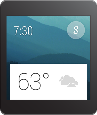
Here you’ll find some guidelines for designing great user experiences on the Android Wear platform. Designing for Android Wear is substantially different than designing for phones or tablets, so we’ll start by describing how your content can work in tandem with the overall Android Wear vision. To better understand the user experience on Android Wear, also be sure to read the UI Overview.
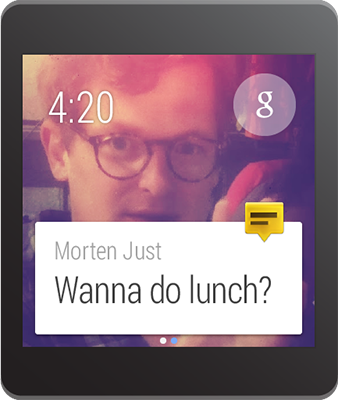
Android Wear experiences are:
- Contextually aware and smart. These devices bring a new level of awareness to computing. Rather than requiring attention and input from users, Android wearables are aware of their situation and state, and helpfully display the right information at the right time. Timely, relevant, specific.
- Glanceable. Wearable devices are used all throughout the day, even when they sit in our peripheral vision. Effective apps provide the maximum payload of information with a minimum of fuss, optimized to provide tiny snippets of relevant information throughout the day. Short, sharp, immediate.
- Zero/low interaction. Staying true to the strengths afforded by a smaller form factor, Android Wear focuses on simple interactions, only requiring input by the user when absolutely necessary. Most inputs are based around touch swipes or voice, and inputs requiring fine-grained motor skills are avoided. Gestural, simple, fast.
- Helpful. Android Wear is like a great personal assistant: it knows you and your preferences, it only interrupts you when absolutely necessary, and it’s always on hand to provide a ready answer. Efficient, respectful, responsive.
By providing a smart connection to the rest of the world while respecting the user’s attention, Android Wear feels personal and global, simple and smart, unobtrusive and ever-ready. Notifications that respect these principles will feel most at home in the overall Android Wear experience.
Notification UI Patterns
Android notifications appear as cards in the main stream and form the core of the Android Wear experience. Many of the main Android Design guidelines for notifications apply in Android Wear. Be respectful of users' attention and aware of how unnecessary interruptions will reflect on your application’s reputation.
Omit needless text from your notifications. Design for glanceability, not reading. Use words and phrases, not sentences. Show, don't tell: where possible use simple icons, glyphs, and visualizations to convey your message.
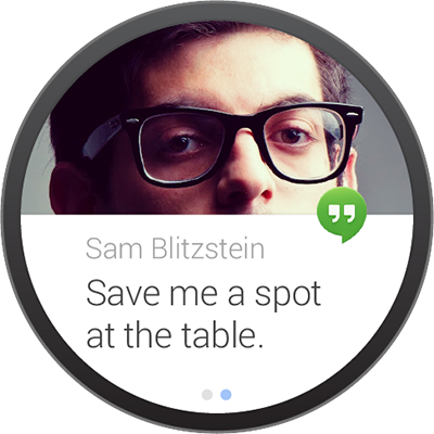
In some cases, particularly with messaging applications, cards will contain dynamic content which may not fit on a single screen. In these cases the content will be automatically truncated to fit on the card and the user may tap to expand, so the full message should be provided.
Notification priority should reflect the urgency of your notification, with only time-sensitive notifications carrying a high priority. Active notifications – that is, those that cause the device to vibrate – should only be used in cases that need the user's urgent attention or action (e.g. a time-based reminder, a message from a friend). Non-urgent notifications (e.g. a transit times card, daily pedometer count, social network updates) should be silently added to the card stream.
Actions
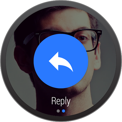
Actions appear to the right of your notification, allowing the user to act on your notification. Up to three actions are permitted. The most-used action should be placed first, so that it is a single swipe away from your content.
Actions consist of an icon and a caption. Icons should be PNG files, white on transparent background, 32 × 32 dp (with 8 dp padding), as specified in the Iconography design guide for action bar icons. Captions should be verb-driven and short, and will be automatically truncated at one line.
Actions are optional. Many useful notifications will not need to include actions at all.
For developer details about action buttons, see Creating Notifications for Android Wear.
Images
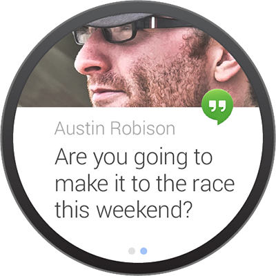
Images appear behind cards in the stream, providing context and additional glanceability. Your image should support the core message of the notification; for example, a card about a sports team could include the team color and logo; a message from a contact should display that person's profile photo.
Bear in mind that the card will partially cover the lower part of the image. Images should be sized as appropriate for the notification appearance on handsets, which is 64 x 64 dp. Image backgrounds move when horizontally swiped, so landscape-oriented images work better on notifications that include pages or actions.
To add large images, use setLargeIcon() with any notification, as
shown in Creating
Notifications for Android Wear.
Application Icons
Your application’s launcher icon will be automatically placed on the card, identifying your notification. Do not use the notification title or background image to identify or brand your application. Instead, allow your icon to identify itself and focus on delivering a clear, succinct message in the card and image. You can choose not to display this icon using
setHintHideIcon().
Pages
Pages are additional cards that can appear to the right of your main card in the stream. If your core message is longer than a short snippet, do not sacrifice glanceability by packing a lot of information into your primary notification. Instead, use pages to provide additional content.
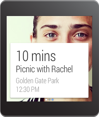
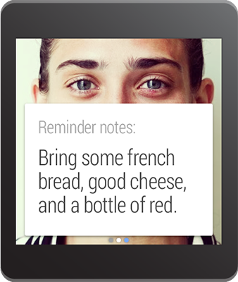
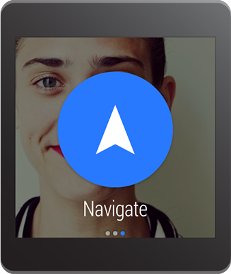
Pages appear immediately to the right of the main notification card. They are typically used to provide additional details or alternate views of the main card’s content. For example:
- A current weather card might provide an additional page showing a three-day forecast.
- A next train departure card might provide an additional page showing subsequent departures times.
- A daily step count card might provide an additional page showing the same measurement in calories and distance.
There is no imposed limit on the number of pages you may add. However, notifications that provide actions should show no more than three pages to ensure that the actions remain easily accessible.
Pages are optional. Many useful notifications will not need to include pages at all.
For developer details about pages, see described in Adding Pages to a Notification.
Notification Stacks
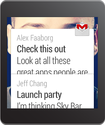
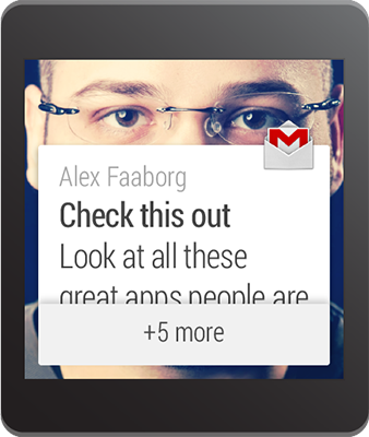
Stacks may be used to collect multiple notifications from the same application into a single stack of cards. Whereas pages are used to provide additional detail on a single notification, stacks are used to collect multiple sibling notifications together. A stack may be expanded by the user to access each individual card contained within.
Stacks are a way of adding multiple useful notifications without overwhelming the user’s stream. If your application may produce multiple concurrent notifications, consider combining them into a stack.
Each notification within a stack can contain separate pages and separate actions that are relevant to that specific notification. The user can access these actions after expanding that notification's card within the stack.
For developer details about stacks, see described in Stacking Notifications.
Voice Replies

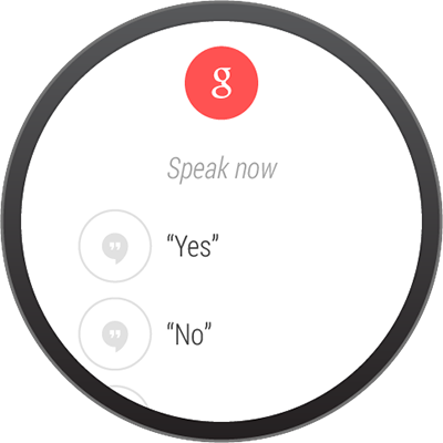
Voice replies are primarily used by messaging applications to provide a hands-free way of dictating a short message. You can also provide a up to five suggested replies or “canned responses” that are useful in a wide range of cases. These canned responses can be tapped by the user, allowing for a fast method of sending simple replies in cases where speaking may not be desirable.
You should attempt to cover a range of simple, neutral replies in your choices. Longer voice replies may be automatically truncated in the Voice reply UI.
For developer details about enabling voice replies, see described in Receiving Voice Input from a Notification.