A new form factor deserves a new UI model. At a high level, the Android Wear UI consists of two main spaces centered around the core functions of Suggest and Demand. Your application will have an important role to play in both of these spaces.
Suggest: The Context Stream


The context stream is a vertical list of cards, each showing a useful or timely piece of information. Much like Google Now on Android phones and tablets, users swipe vertically to navigate from card to card for a brief and comprehensive update about what's important to them. Only one card is displayed on screen at a time, and background images are used to provide additional visual information. Your application can create cards and inject them into the stream when they are most likely to be useful.
Cards in the stream are more than simple notifications. They can be swiped horizontally to reveal additional pages. Further horizontal swiping may reveal tappable buttons, allowing the user to take action on the notification. Cards can also be dismissed by swiping left to right, removing them from the stream until the next time they have useful information to display. In the emulator, hovering the mouse over the top of the screen illuminates a blue bar at the top of the device that takes you home when clicked.
Demand: The Cue Card


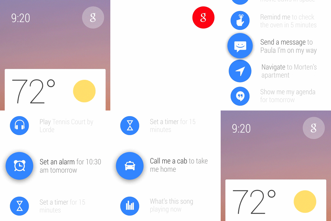
For cases where the context stream can't anticipate what the user would like to do, the cue card allows users to speak to their device. The cue card is opened by saying, "Ok Google" or by tapping on the "g" icon on the home screen. Swiping up on the cue card shows a list of actions, which can also be tapped.
The list of actions includes Android intents for voice actions. The upcoming Android Wear SDK will enable developers to match their applications to these intents so users can perform actions using these voice commands. Multiple applications may register for a single voice intent, and users will have the opportunity to choose which application they prefer to use.